SharePoint Site Design
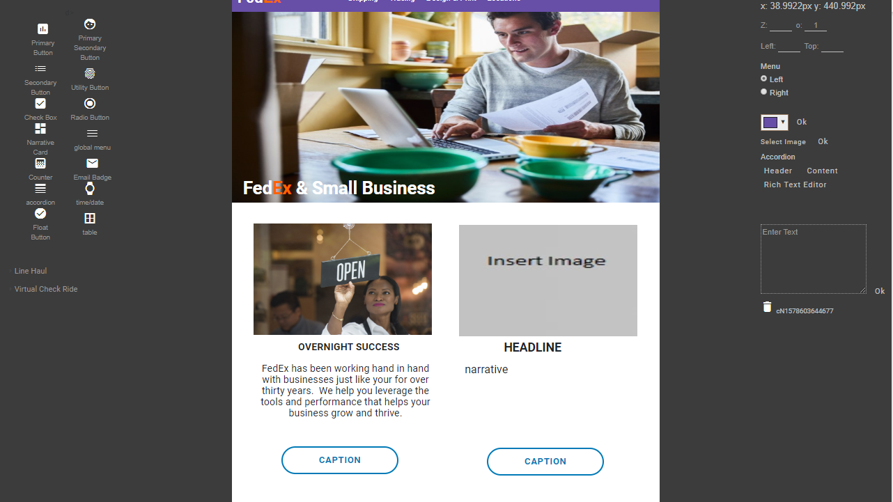
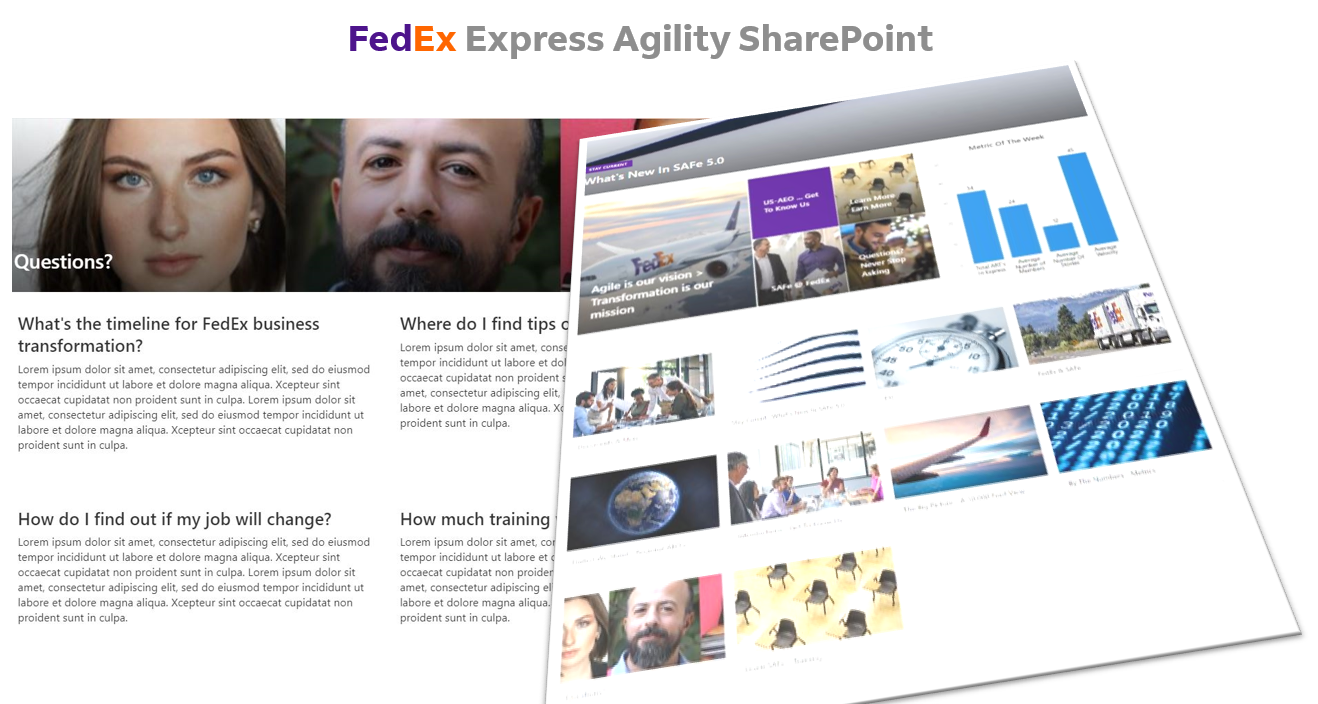
I was tasked with designing an important go-to SharePoint site at FedEx Express. I faced a familiar challenge: SharePoint’s template-driven structure and self-authored content often leads to uninspired, utilitarian sites that feel clunky, difficult to navigate and difficult to read. Worse, many lack a cohesive content strategy, making it difficult for users to find the information they need. My goal was to transform this template-bound platform into a polished, professional resource that delivered real business value.
The first obstacle was SharePoint’s rigid design framework. Instead of focusing on limitations, I explored ways to creatively use the tools available. I structured the site to guide users intuitively, avoiding the clutter and confusion typical of many SharePoint implementations.
Content was another hurdle. Too often, SharePoint sites rely on dense, text-heavy pages. To combat this, I used strategies from effective web design: easy to skim layouts with white space, strong headlines, concise sentences, and active voice. I crafted content that was clear and actionable, ensuring users could find key information quickly and easily.
Visuals were equally important. I knew high-quality images would make the site stand out. I drew on an extensive collection of professional images from FedEx branding.
This project reinforced my belief that even within constraints, thoughtful design and strategy can produce exceptional results.